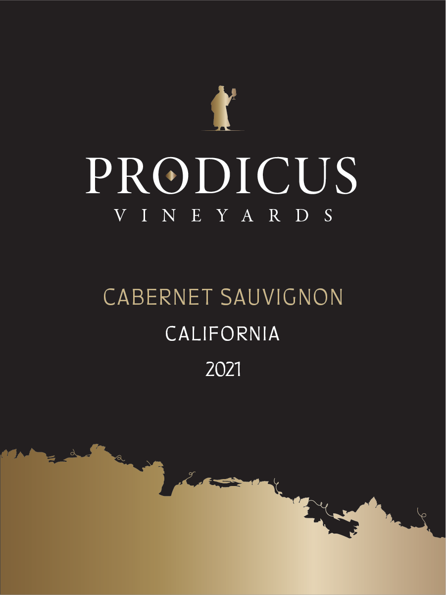
Prodicus Wine
Disciplines: Concept, Packaging Design, Naming
Client: Fior di Sole
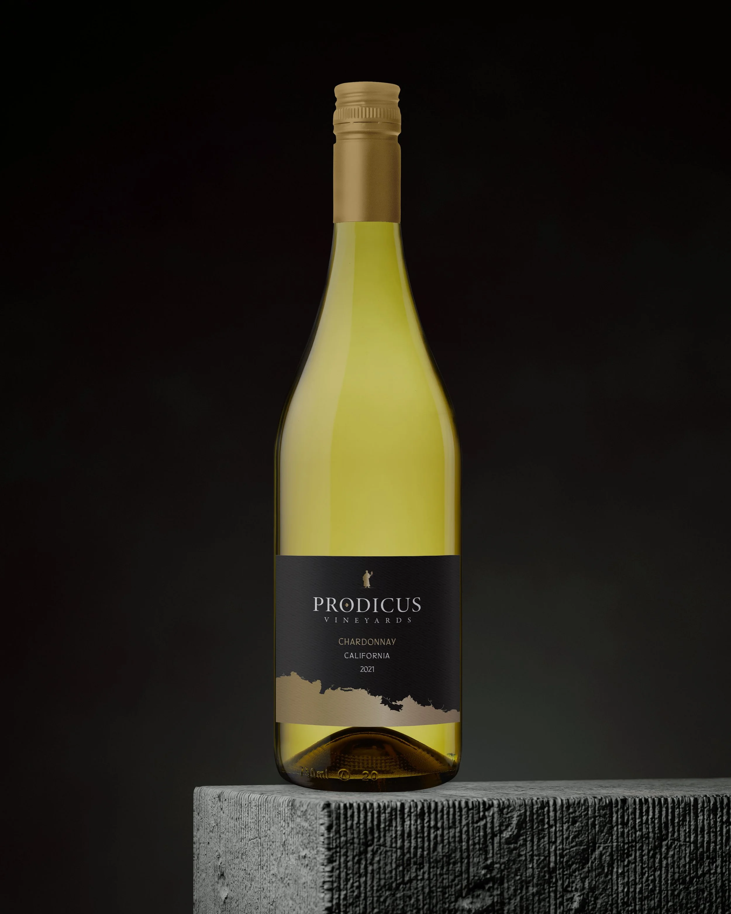
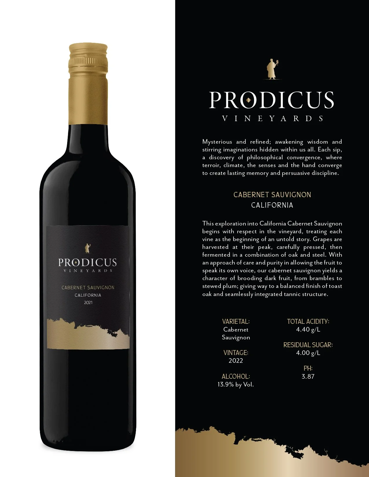
Prodicus is a virtual wine brand that was created for Fior di Sole for an international client. Prodicus was a Greek philosopher and part of the first generation of Sophists. Just as wine improves with age, wisdom is often gained through experience. This metaphor emphasizes the idea that making thoughtful choices often comes from reflecting on past experiences, much like a well-aged wine reveals deeper flavors over time.
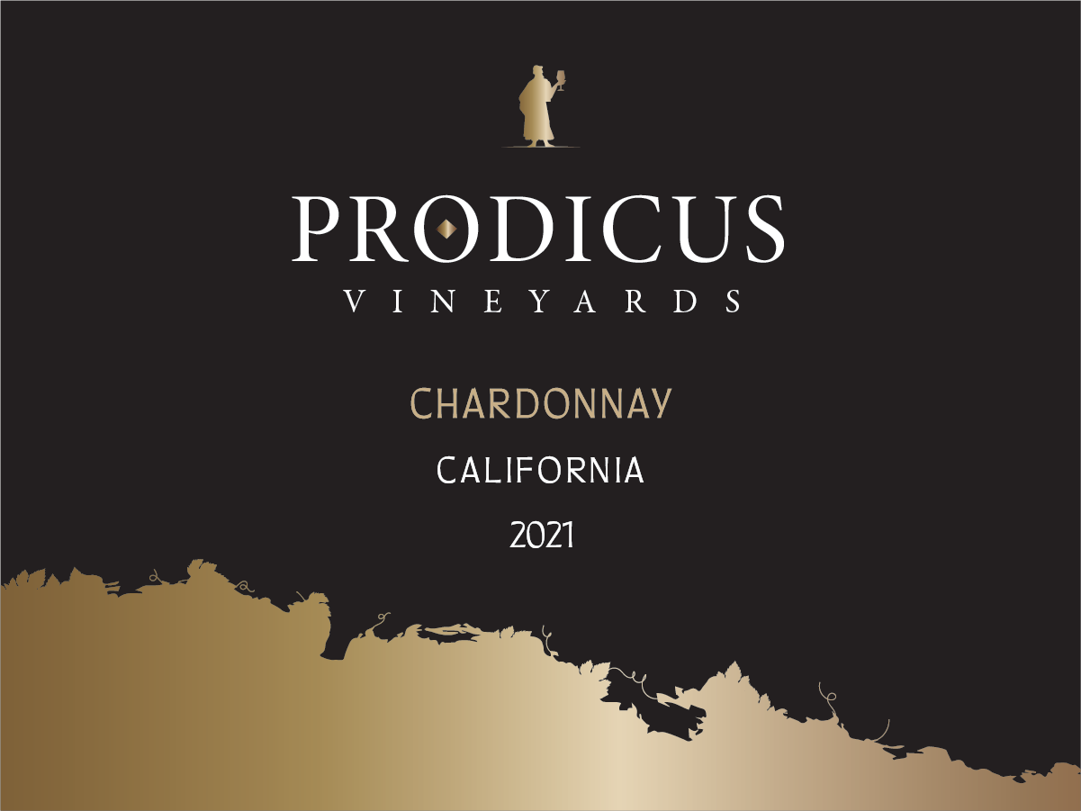
My role was creating the overall concept, brand name, illustrations, packaging, and print embellishments.
-
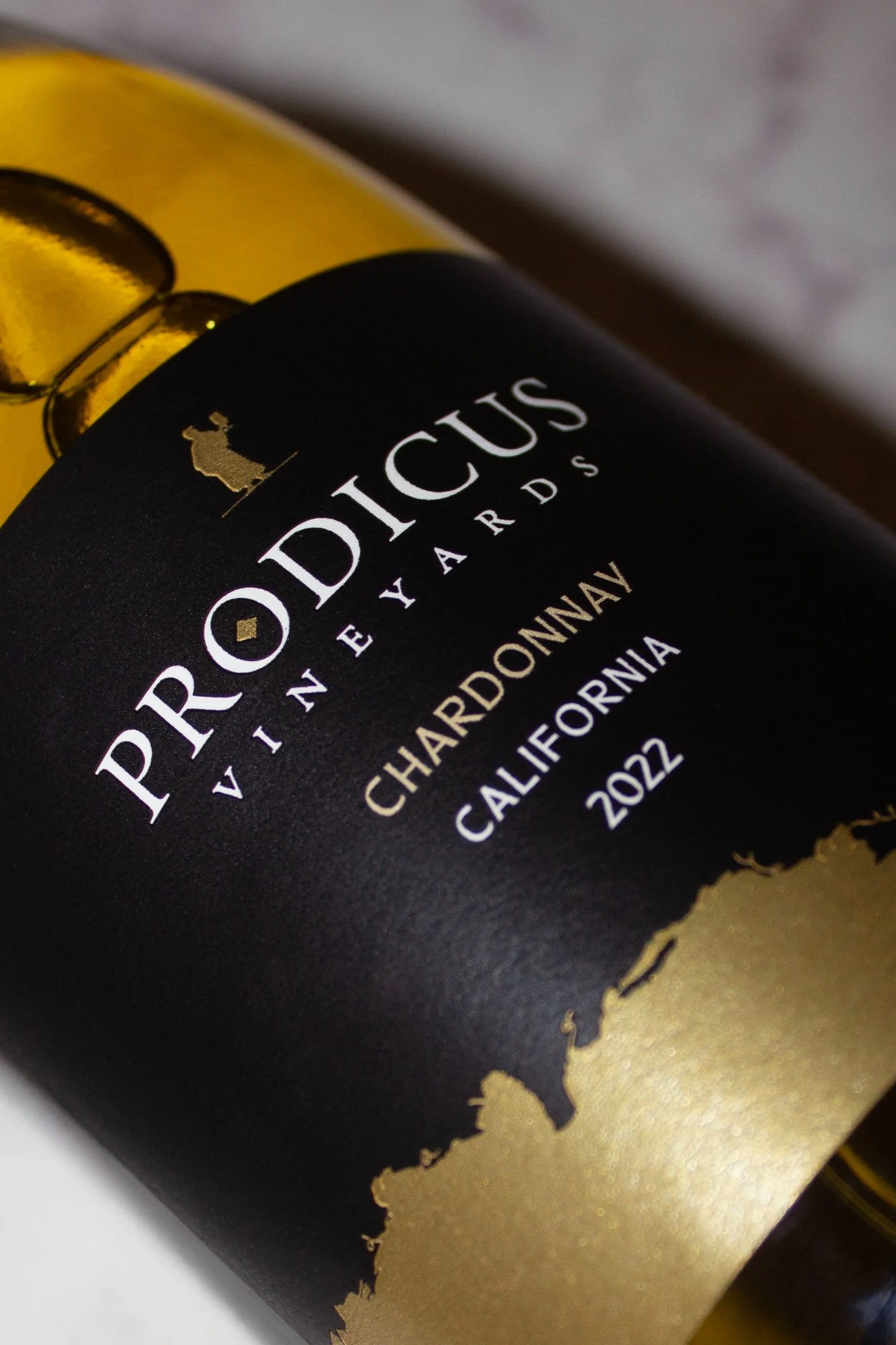
Part of the challenge when creating Prodicus was the low budget for the print embellishments. I had to ensure that the wine packaging looked elevated, while still maintaining a low budget.
Since gold foil requires a custom flexo plate, that cost was removed by using a high shine silver paper with a yellow tint that mimicked gold foil, and printing black on top of it, massively reducing cost.My role was creating the overall concept, brand name, illustrations, packaging, and print embellishments.


